Brand System
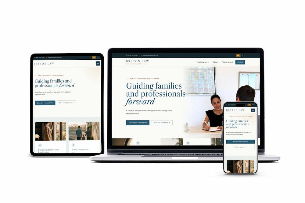
Breton Law
A new immigration practice launching with a business card she loved and a Caslon wordmark — extended into a complete brand system and a bilingual production site at breton-law.com.
EN/FR locales live 9 pages shipped
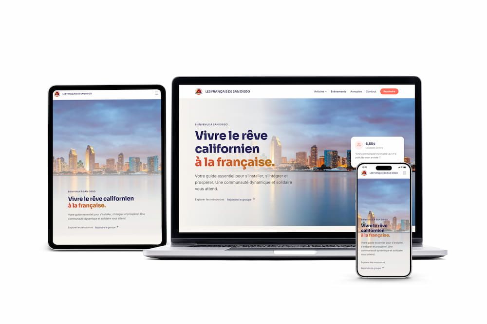
From Career Transition to Premium Bilingual Brand
A new identity, built from scratch in four weeks, that bridges pharmaceutical credibility with the warmth a life-coaching practice needs — and ships in French and English from day one.
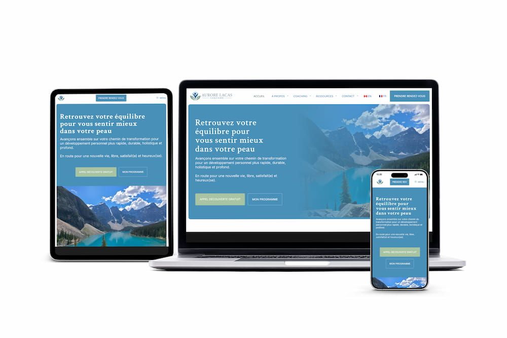
From a blank page to a brand identity, a bilingual website, and an SEO foundation that worked from day one.
Discovery & positioning Audited the French-speaking coaching market. Identified the gap: clinical credentials applied to coaching, not the other way around. Built the positioning around Aurore's pharma background, not despite it.
Brand identity, from scratch Logo, five-color palette, type system on Montserrat, and a one-page voice guide. Designed to read as professional and warm in both languages, neither corporate nor clinical.
Bilingual site build Custom WordPress theme on GeneratePress. 30+ pages in French and English with TranslatePress. Booking integration for free discovery sessions, newsletter signup, contact forms, and mobile-first responsive layout.
Launch & SEO foundation Schema, sitemap, and hreflang configured at launch. Metadata reviewed and translated page by page. Indexing verified across both locales before handoff.
Three calls made at the start that defined how the brand would talk, look, and convert.
French carries the primary voice; English is a credible second, not a Google-Translate echo. Cultural authority in two markets, written natively in each.
Logo, palette, type system, and voice guide were built before the website existed. The brand carries the credibility; the site delivers it. A coach can't lead with the URL. She has to lead with the identity.
GeneratePress + TranslatePress + RankMath: not a heavy multilingual page-builder stack. Faster pages, fewer maintenance points, and a CMS Aurore can edit herself without calling for help.
Four deliverables, each meant to outlast the launch.
Positioned Aurore's existing 6-week framework and offers with a clear progression path for prospective clients
Integrated scheduling for free 30-minute consultations
French-first approach with English accessibility
Fully responsive design for all devices
We developed a complete brand identity that balances professionalism with warmth, using psychology-driven design choices to create immediate trust and connection.
Navy anchors credibility, cyan and blue-gray introduce warmth without softening the authority. Warm beige and charcoal carry body copy at AA contrast in both locales.
One family, working harder. Weight 900 for editorial headlines, 500 for reading. No ornate display face — the substance comes from the writing.
Aurore Lacas
Bridging science and serenity.
A sprout drawn as a single contour signals growth without being literal. Coaching as cultivation, not transformation — the mark had to earn trust before the name did.
Languages live
Discovery to launch
Pages shipped
Brand built
Leveraged Aurore's pharmaceutical background to differentiate from typical life coaches, establishing credibility through structured, evidence-based approach.
Carefully selected blues for trust and calm, greens for growth and healing. We avoided dark colors that could trigger anxiety in the target audience.
Built the About page as a vulnerable, authentic narrative that mirrors client struggles, creating immediate emotional connection and trust.
Designed every page element to reinforce transformation promise: "From anxiety to confidence" messaging throughout user journey.
Multiple touchpoints for engagement: free discovery session, newsletter, contact form, meeting visitors at their comfort level.
Built for international reach with phone, video, and in-person session options. Coaching delivery isn't geographically constrained. The site reflects that.
Xavier created my WordPress website for my life coaching business, and I couldn't be happier with the result. He was incredibly attentive to my needs, making sure the final product truly reflected who I am, my values, and what I wanted to communicate. The result went beyond my expectations. It's not only beautiful and professional but also perfectly aligned with my vision. I've received nothing but compliments from my clients about the site!
A new immigration practice launching with a business card she loved and a Caslon wordmark — extended into a complete brand system and a bilingual production site at breton-law.com.
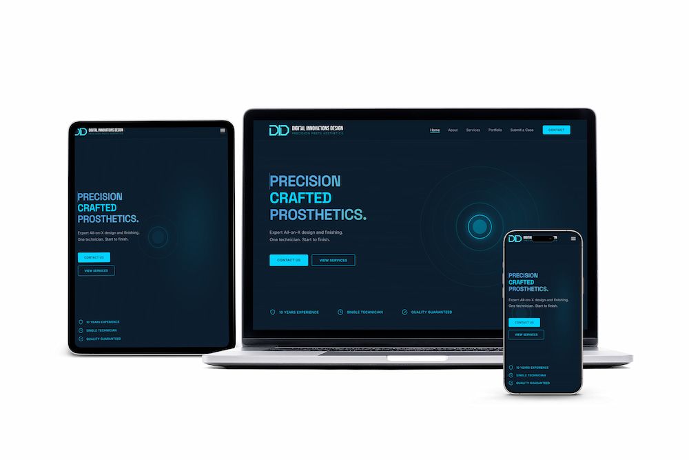
A dental prosthetics studio with zero web presence — brand system, design tokens, and SEO architecture shipped as a complete production site at digitalinnovlab.com.
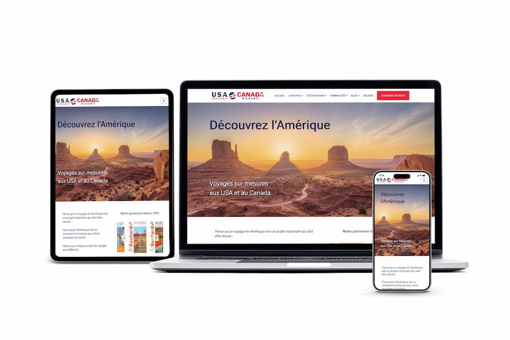
A 20-year consultancy whose website was stuck in 2004 — rebuilt for modern search visibility.
A community platform outgrowing WordPress — migrated to static architecture for performance and scale.
Whether you're starting fresh or transforming your business, we create brands and websites that connect with your ideal clients and drive real results.