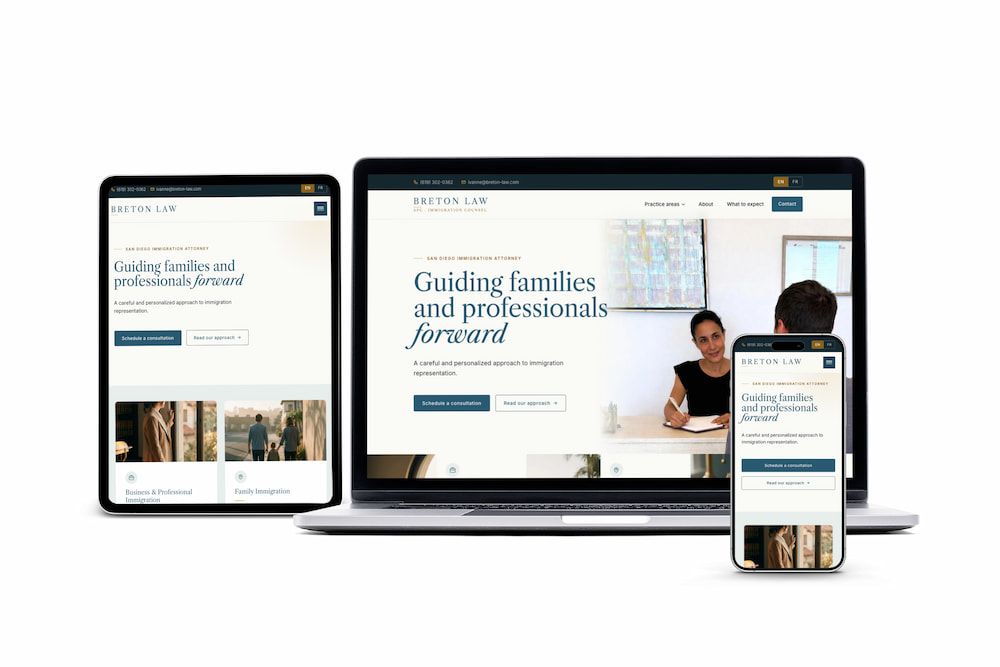
Brand System
Breton Law
A new immigration practice launching with a business card she loved and a Caslon wordmark — extended into a complete brand system and a bilingual production site at breton-law.com.
EN/FR locales live 9 pages shipped
From Zero to Precision Brand
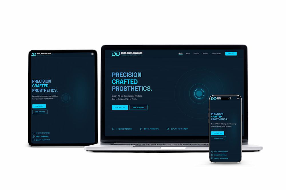
A complete brand system, design tokens, and SEO architecture for a boutique dental lab — shipped as a live production site at digitalinnovlab.com.
Five phases of foundation work (competitive research, positioning, voice, design system, keyword architecture) before any production code. Every page that shipped was informed by strategy, not by a hunch.
Discovery & competitive mapping Audited the corporate-lab landscape: Glidewell, Absolute Dental, Pacific Dental. Surfaced the open positioning lane: no competitor paired single-technician accountability with a premium digital presence.
Positioning & voice Named the brand voice 'Calm Technical Authority': confident, clinical, no hype. Reframed the single-technician model as the differentiator rather than a constraint.
Design system Built the visual system from CT-scan and dental-imaging references: Deep Slate, Clinical Cyan, Titanium Silver, Warm Bone. Typography, spacing tokens, components, and contrast ratios documented before the first production page.
SEO & keyword architecture API keyword analysis across 300+ phrases. Treated each H2 block as a mini-landing page to make a five-page site target dozens of intents. 'What is All-on-X' surfaced as 762 AI searches/month vs. 40 on Google.
Build & launch Hand-coded on Astro: no templates, no plugins. Dark-mode-only interface, Space Grotesk + Inter, scroll-triggered reveals, HIPAA-aware case intake. Live at digitalinnovlab.com.
Where we drew the lines (on positioning, search, and compliance) and why each call held up under scrutiny.
Clinical precision without jargon. The brand speaks to dentists as a peer: confident, clear, zero hype. A deliberate rejection of the standard dental-marketing playbook.
Corporate labs rotate staff across cases. DID keeps one set of hands on every case from CAD design through ceramic finishing. We positioned this as the differentiator, not a limitation.
The original plan used Dropbox file requests for case submission. Research surfaced HIPAA exposure on patient-adjacent files. We pivoted to a Jotform BAA before writing production code, not after.
API-level keyword analysis showed AI search volume dwarfing Google for several core dental terms. Content structure was shaped by LLM discoverability, not just on-page SEO conventions.
Four deliverables, each meant to outlast the launch.
Logo, palette, typography, and voice — from blank page to applied across the site.
Hand-coded theme, mobile-first responsive, six core pages.
Schema markup, keyword-mapped pages, sitemap and hreflang in place from day one.
Compliant patient-adjacent form via Jotform BAA, secure file delivery via Dropbox.
The design direction draws from CT scan and dental imaging aesthetics: dark, cinematic, precise. A deliberate contrast to the clinical-white look most dental labs default to. We secured a domain name, designed a custom logo rooted in the CAD/blueprint visual language, and documented every color, typeface, and component in a complete brand guidelines system before production began. The live site ships dark-mode-only, pairing Space Grotesk headings with Inter body copy across a cyan-accented slate palette.
A deliberate inversion of the clinical-white default. Deep slate and carbon carry authority on dark backgrounds; clinical cyan reads as precision rather than technology; warm bone prevents the palette from reading cold.
Geometric precision over warmth. Inter's clean lines carry clinical authority on dark backgrounds — the contrast between headline weight and body text mirrors the brand's tension between technical rigor and accessibility.
Digital Innovations
Precision dental prosthetics.
An EEG waveform bisected by a precision line encodes dental craftsmanship as signal, not artifact. The cyan mark reads as both data and identity — technical enough to earn trust in a lab context, distinct enough to hold on a website.

Brand system
Pages shipped
Keywords mapped
Accessibility
I'm really liking the website. I appreciate your great work — I'm glad I made the decision to go with you.
A new immigration practice launching with a business card she loved and a Caslon wordmark — extended into a complete brand system and a bilingual production site at breton-law.com.
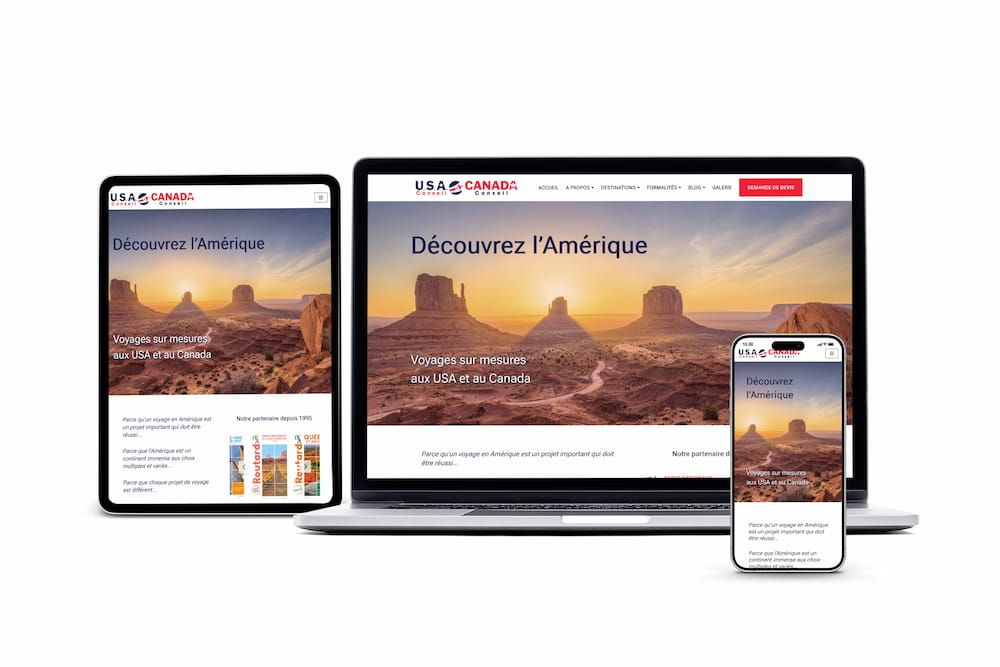
A 20-year consultancy whose website was stuck in 2004 — rebuilt for modern search visibility.
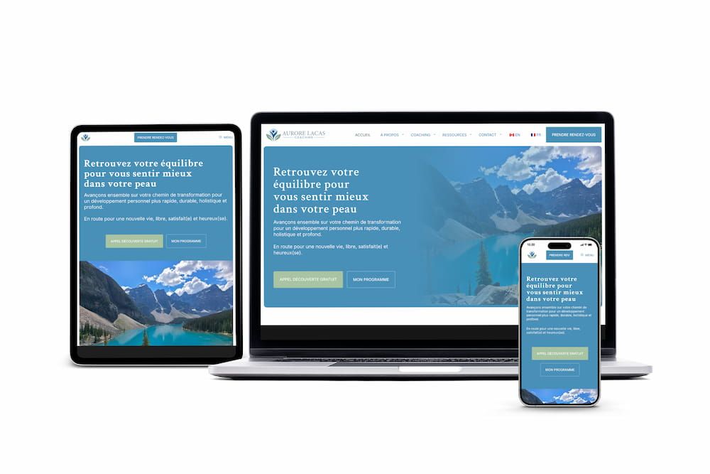
A career-changing coach who needed a brand identity and bilingual website from scratch.
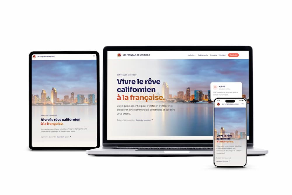
A community platform outgrowing WordPress — migrated to static architecture for performance and scale.
Digital Innovations Design is what happens when you invest in strategy before code. Brand system, competitive positioning, SEO architecture, and a shipped production site. All from a single-technician studio that started with zero online presence. Let's do the same for yours.