A Refined Brand and Website for an Immigration Attorney
A Refined Brand and Website for an Immigration Attorney
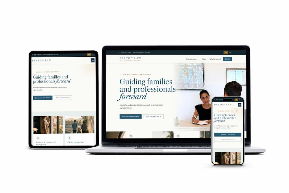
Ivanne Tonnessen launched Breton Law with a business card she loved and a wordmark already set in Caslon. We took both as the brief, extended them into a complete brand system, and shipped a bilingual production site at breton-law.com.
Brand identity
Web design
Web development
Bilingual (EN/FR)
0→1
Brand system
9
Pages shipped
EN/FR
Locales live
WCAG AA
Accessibility
Our process
Five Phases Starting From What She Already Had
Ivanne came with two locked decisions: Caslon and a deep teal. We took both as the brief, then built the rest of the identity around them: voice, palette extensions, type pairing, components, bilingual architecture, and finally a production site at breton-law.com.
01
Starting from the card in her pocket Ivanne came to the project with two anchors already locked in: a printed business card set in Caslon, with a deep muted teal she'd been using on her stationery. Everything else was open. The first phase wasn't research from a blank page. It was reading what her existing identity already said and naming the direction her instinct was pointing toward.
02
Two brand directions, side by side Built two distinct, internally coherent brand directions (both anchored to her teal and Caslon) diverging in mood, typography pairing, and imagery treatment. Delivered as a side-by-side HTML comparison so Ivanne could see each system in production form, not as swatches on a board. She chose First Light: the lighter, more contemporary of the two.
03
Voice & terminology lock Codified sentence-level rules. "The firm" instead of "we" while there's one attorney. "Schedule a consultation" instead of "book your free intake call." Visa codes stay roman; loanwords italicized inside French copy. Formal vous throughout the French, with non-breaking spaces before every ?, !, :, and ; per native typography.
04
Design tokens & type system The teal stayed: #285A71, lifted straight from her business card. Caslon stayed, resolved to Libre Caslon Text (a Google Fonts revival that preserves the print continuity) and paired with Inter for body and UI. Added vellum for the page, ochre for hairlines, sea foam for section ground. Every contrast ratio verified against WCAG AA.
05
Build & launch Hand-coded on Astro with LESS tokens and @fontsource-variable for performance. Nine paired EN/FR routes with proper localized slugs. Shipped live at breton-law.com: sitemap, hreflang, and schema in place from day one.
Strategic decisions
The Four Calls That Shaped the Brand
Four decisions made at the start that defined how the system would extend Ivanne's existing identity, and how everything beyond it would behave.
01
Caslon Stays. Everything Else Evolves.
Ivanne's printed business card was already set in Caslon. Rather than rebrand around a new typeface, we built the system around Libre Caslon Text, a Google Fonts revival that preserves the print continuity. Inter handles body and UI. Two families, one editorial register, and the wordmark she already had at the centre.
02
The Teal Carries the Brand
#285A71 came straight from her business card. Rather than treat it as one color among many, we made it the anchor of the entire system: wordmark, headings, links. Vellum, ochre, sea foam and a deeper teal were added around it, never replacing it, always extending it.
03
Founder-Led Voice, Not Corporate "We"
Most U.S. law firms write in the corporate "we" regardless of headcount. Breton Law is a single-attorney practice. The copy says so. "Most clients work with Ivanne directly, from the first call to the final approval." The voice scales to "we" only when a second attorney is hired.
04
Native French, Not Translated French
French copy is treated as native, never machine-translated. Formal vous, guillemets « » for quotations, non-breaking spaces before terminal punctuation, italics for English loanwords (« le H-1B ») inside French copy. Visa codes stay roman.
What shipped
Four deliverables, built to outlast the launch
A full brand system extended from her business card, a bilingual Astro site, an editorial component library, and a multi-section style guide — each built to live longer than the launch.
Brand system extended from her card
Logo system (stacked, inline, monogram) built around Ivanne's existing Caslon wordmark, five-color palette anchored to the teal from her business card, type pairing locked, voice and terminology written down in a multi-section style guide.
Bilingual Astro site
Hand-coded on the CodeStitch Advanced-Astro-i18n base. Nine paired EN/FR routes with proper localized slugs — /fr/a-propos, /fr/processus, /fr/domaines-de-pratique.
Editorial component library
Custom components replacing the starter's generic UI: portrait hero, practice area cards, italic-word section openers, editorial dividers with ochre hairlines, language toggle with proper ARIA.
Style guide ready for handoff
A multi-section style guide covering palette, typography scale, wordmark construction, voice and terminology, component patterns, accessibility commitments, and a CSS variables block — production-ready for any future designer or developer.
The visual system
A Visual System That Started From Her Business Card
Two things were already locked when Ivanne arrived: a deep muted teal pulled from her printed business card, and a Caslon-set wordmark. We kept both, then extended the system outward: vellum for the page background, ochre for hairlines and accents, sea foam for section ground, and a deeper teal for footer surfaces and authority moments. The typography pairing resolved to Libre Caslon Text for display (a Google Fonts revival that preserves the print continuity) and Inter for body and UI. Every combination verified against WCAG AA, with oldstyle figures activated site-wide.
Color System & Rationale
Two colors were already locked when Ivanne arrived: the deep teal from her printed business card, and the Caslon her wordmark was set in. We kept both, then extended outward — vellum for the page, ochre for hairlines, sea foam for section ground, and a deeper teal for footer surfaces. Never replacing the teal, always anchoring to it.
5 colors·WCAG AA verified
01
Breton Teal#285A71
02
Teal Deep#143844
03
Sun Ochre#D4A24C
04
Sea Foam#E8EEEA
05
Vellum#FAFAF7
Typography
Caslon stayed from Ivanne's existing wordmark. We resolved it to Libre Caslon Text — a Google Fonts revival that preserves the print continuity with her business card — and paired it with Inter for body and UI. Two families, one editorial register, both served locally via @fontsource-variable for performance.
Libre Caslon Text·Inter
Breton Law
APC · Immigration Counsel
Libre Caslon · 400Inter · 500Oldstyle figures
Logo system
Ivanne's existing Caslon-set wordmark became the system. Three configurations: stacked (site header and letterhead), inline (mobile and email signatures), and a “BL” monogram inside a thin oval frame for favicons and document seals. Brand-primary on vellum, or vellum on brand-deep — never recolored, never enclosed except as the monogram.
3 lockups·SVG + PNG·Full favicon set
What the client said“
I recently worked with Xavier at Oui Digital to create my website and had a great experience. He was responsive, professional, and attentive to my needs throughout the process. The final result looks great. He was always quick to make any changes or answer questions. I would definitely recommend his services to anyone looking for a reliable and knowledgeable web designer.
Every color and typeface in the system traces back to what Ivanne already had in her hand. The teal is from her printed card. Caslon is the typeface her wordmark was already set in. The rest of the palette and the body face extend outward from those two anchors. They don't replace them.
Decision · 02
A Founder-Led Practice, Not a Templated Firm
Breton Law is a single attorney. The brand says so. "Most clients work with Ivanne directly" is both the operating model and the marketing line, and the copy reads in the first person where most firm sites default to the corporate "we."
Decision · 03
French as a Native Locale
No hreflang afterthought. Nine paired EN/FR routes with proper localized slugs (/fr/a-propos, /fr/domaines-de-pratique), not query parameters. Native French typography rules (vouvoiement, guillemets, non-breaking spaces before terminal punctuation) baked into the CSS.
Decision · 04
A Style Guide Ivanne Can Hand to Anyone
A multi-section style guide covering palette, typography, voice, component patterns, accessibility commitments, and a CSS variables block. Production-ready for handoff to any future designer, photographer, or developer. No translation needed.
Decision · 05
Motion as Editorial Punctuation
Hero text loads still. Body paragraphs don't fade or slide. Motion is reserved for hover states, link underlines, and a single fade-up on section reveal. Restraint reinforces the firm's tone of quiet confidence.
Decision · 06
AA Accessibility, Non-Negotiable
WCAG AA across every color combination. Color never carries meaning alone. 3px focus rings on every interactive element. Skip links and language toggles with proper ARIA. prefers-reduced-motion honored without exception.
Built With
Astro: Static site framework on a CodeStitch Advanced-Astro-i18n base
LESS: Brand-specific tokens and utility overrides
@fontsource-variable: Libre Caslon Text + Inter, served locally for performance
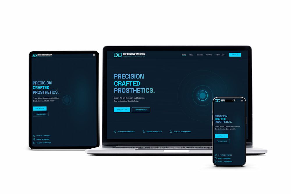
A dental prosthetics studio with zero web presence — brand system, design tokens, and SEO architecture shipped as a complete production site at digitalinnovlab.com.
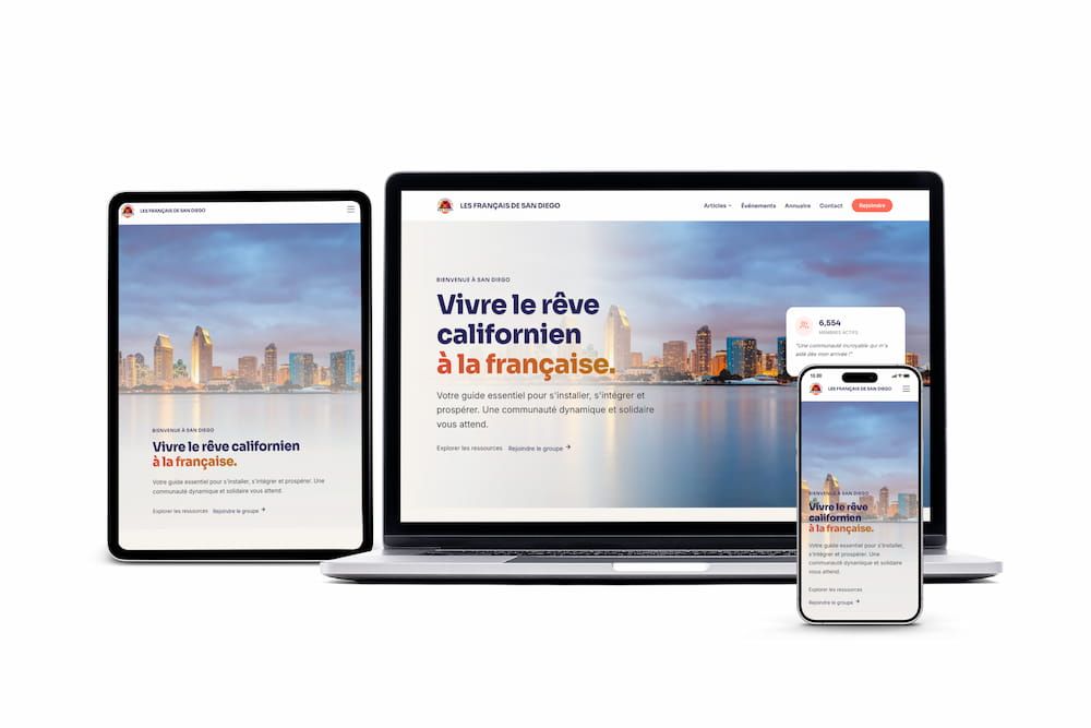
A community platform outgrowing WordPress — migrated to static architecture for performance and scale.
WP → Astro architecture
·
Static HTML delivery
★★★★★“Responsive, professional, and attentive to my needs throughout the process.”— Ivanne Tonnessen, Breton Law
↗
Launching a Practice? Let's Build Around What You Already Have.
Breton Law shows what happens when a brand grows from an anchor (a business card, a typeface, a teal) rather than starting from nothing. If you're launching a practice or evolving one, we build identity systems that hold up at every scale, from the card in your pocket to the homepage hero.